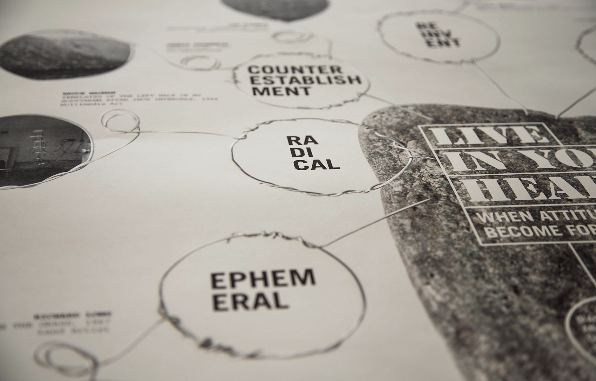
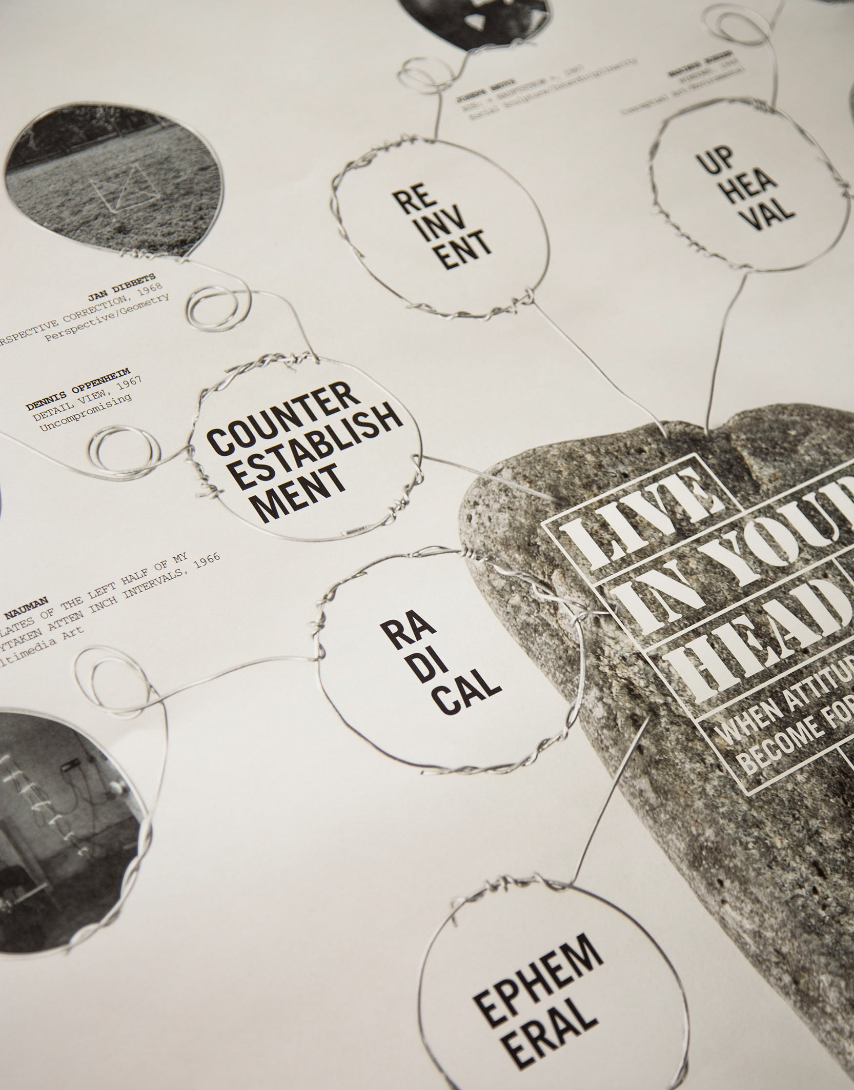
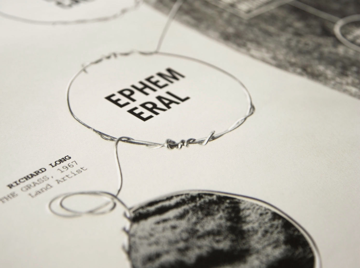
This map was made for a 1969 exhibition in Switzerland called "Live in Your Head." I always examine different techniques to find a better result to convey my visual message. The exhibition's title and the art styles of the works in it inspired me to develop my idea of using a stone to symbolize a head with wired branches coming out of it. The graphic design styles prevalent during that era influenced my decision to use particular typefaces.
![](https://cdn.myportfolio.com/22f2fce5b42b9d471ab2ef315cea4509/f3f284b010d782879439d312_rw_1920.jpg?h=200bc73f4038460b0a983b25a8aab36e)
![](https://cdn.myportfolio.com/22f2fce5b42b9d471ab2ef315cea4509/f38d0386e41b644e0dce675c_rw_1920.jpg?h=c95de161ef08fc8f7c29adbd2003e473)
![](https://cdn.myportfolio.com/22f2fce5b42b9d471ab2ef315cea4509/49896523f803731aa307d29d_rw_1920.jpg?h=55c233665f4e5f40115b177f669ff4c6)
![](https://cdn.myportfolio.com/22f2fce5b42b9d471ab2ef315cea4509/16c1fb87a5496f14ca4984af_rw_1920.jpg?h=f9796fb3b8994b0b6f676c6ec10bcc8e)
![](https://cdn.myportfolio.com/22f2fce5b42b9d471ab2ef315cea4509/10b98d10106edcadecbea3d7_rw_1200.png?h=dd02d1c778f3c2f6b779f25ffaa3341c)